Personalize Answered List with built-in themes, custom colors, fonts, and background images.
Appearance Screen
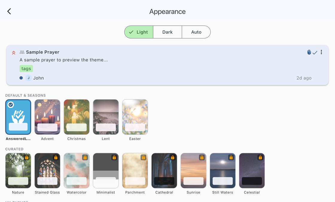
Go to Settings > Appearance to access all theme and visual customization options. A live preview card at the top of the screen updates instantly as you make changes, so you can see exactly how your choices will look.
Light, Dark, and Auto Mode
At the top of the Appearance screen, choose how the app responds to your device brightness setting:
- Light — Always use a light appearance.
- Dark — Always use a dark appearance.
- Auto — Follow your device setting, automatically switching between light and dark.
Some themes are designed for both light and dark modes, while others are optimized for one or the other. In Auto mode, themes that support both will adapt automatically.
Built-In Themes
Answered List includes 14 built-in themes, each with its own color palette and background image. Tap any theme thumbnail to preview it, and tap again to apply.
Free Themes (5)
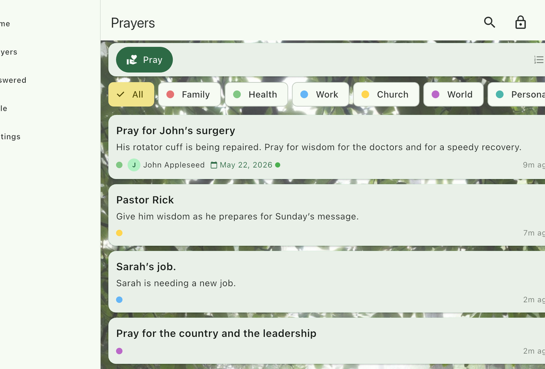
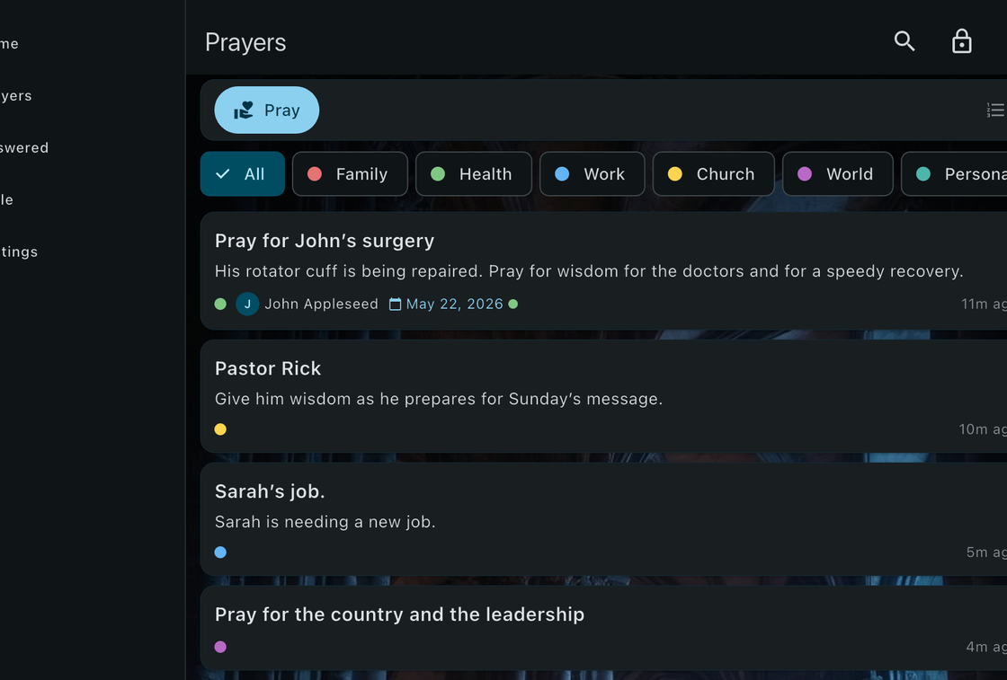
- Answered List — The default theme with the Answered List logo as a subtle background watermark. Adapts to both light and dark modes.
- Advent — Purple and gold with a contemplative candlelight background. Designed for the Advent season.
- Christmas — Rich red and green with a warm, festive background. Designed for the Christmas season.
- Lent — Muted purple and grey with a subdued desert-tone background. Designed for the Lenten season.
- Easter — Soft pink and yellow with a bright floral background. Designed for the Easter season.
Premium Themes (9)
Premium themes display a lock icon on their thumbnail. You can preview any premium theme before purchasing. Unlock them with a Premium subscription.
- Nature — Sage green with a forest background.
- Stained Glass — Deep blue and gold with a stained glass background.
- Watercolor — Teal and coral with a soft watercolor wash background.
- Minimalist — Grayscale with a clean, distraction-free look.
- Parchment — Warm sepia with an aged paper texture background.
- Cathedral — Stone grey and gold with a candlelit architecture background.
- Sunrise — Warm orange and blue with a horizon background.
- Still Waters — Deep navy with a calm water background.
- Celestial — Dark indigo with a starry night sky background.
Nature theme
Cathedral theme
Custom Theme Editor (Premium)
Create your own theme by tapping the + button in the My Themes section of the Appearance screen.
The editor includes the following options:
- Theme Name — Give your theme a memorable name.
- Brightness — Choose Light or Dark as the base.
- Primary Color — The main color used for app bars, buttons, and highlights.
- Secondary Color — A complementary color used for chips, tags, and accents.
- Scaffold Background Color — The main background color of every screen.
- Background Image — Choose a photo from your library as the theme background.
- Background Opacity — Control how prominently the background image appears.
- Card Text Brightness — Override the automatic text color on cards (auto, light, or dark).
A live preview card updates in real-time as you adjust settings, so you can see exactly how your theme will look before saving.
Managing Custom Themes
- Edit or delete — Long-press any custom theme tile to edit, delete, or share it.
- Apply — Selecting a custom theme applies it immediately.
- Storage — Custom themes are stored locally on your device.
Theme Sharing
Share your custom themes with friends by exporting them as .answeredlisttheme files. Long-press a custom theme and select Share to send the theme via Messages, email, AirDrop, or any other sharing method.
To import a shared theme, simply open the .answeredlisttheme file on your device. Answered List will show a preview and ask you to confirm the import. The imported theme appears in your My Themes section.
Theme files contain only color and style settings — no images or personal data are included.
Other Appearance Settings (Premium)
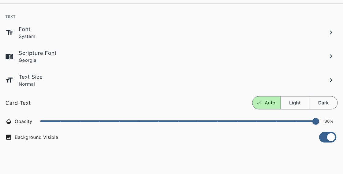
Font
Choose the typeface used throughout the app. Available options:
- System (default)
- Merriweather
- Caveat
- Lato
- Lora
- Nunito
Scripture Font
Choose a separate typeface for Bible verses and scripture text. This applies to the Verse of the Day card, the Bible chapter reader, and linked verses on prayer detail screens. Available options:
- System
- Georgia (default)
- Merriweather
- Caveat
- Lora
- Playfair Display
- Josefin Sans
Text Size
Adjust the text size to your preference. Choose from Small, Normal, Large, or Extra Large.
Card Text Brightness
Override the automatic text color on prayer cards. Choose Auto (determined by your theme), Light, or Dark. This is useful when using a custom background image that makes the default text color hard to read.
Background Opacity
Control how prominently your theme’s background image appears behind your content. Adjust the slider from 10% (barely visible) to 100% (fully visible). This setting applies to whichever theme is currently active.